Tow Youth Justice Institute
TYJI at University of New Haven has been instrumental in juvenile justice reform in Connecticut. As they reached a 10-year milestone, it was time for a brand that could express who they are and position them for future success.Visit website
towyouth.newhaven.eduFounded in 2014, Tow Youth Justice Institute has led the way for juvenile justice reform in CT through the engagement of policy makers, practitioners, service providers, and communities. TYJI works to promote the use of effective, data-driven practices, programs, and policies related to youth justice.
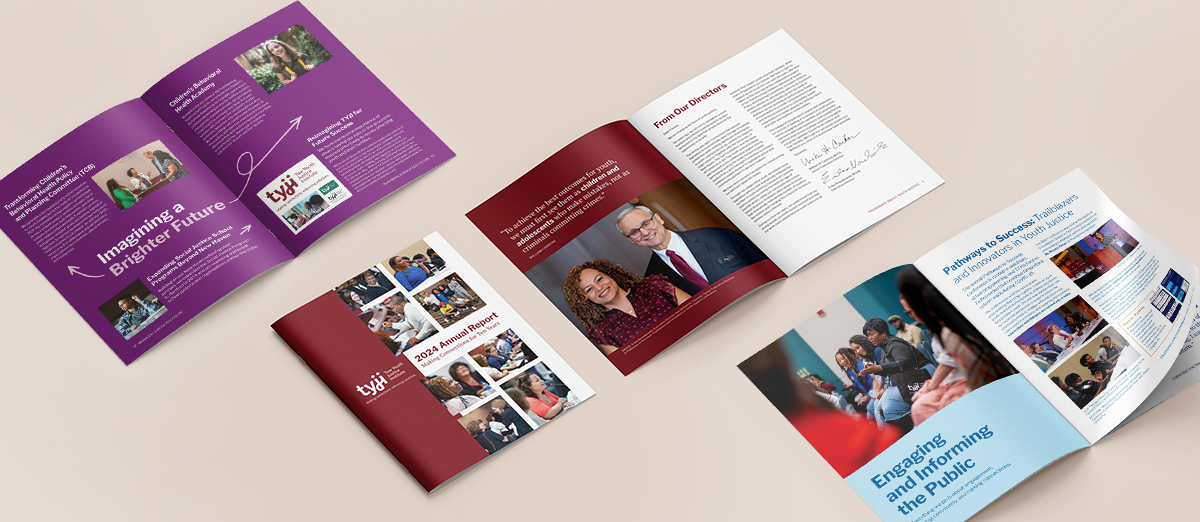
Our work included research to understand who TYJI is, their challenges with their current brand, and how they are changing as an organization. We created a brand brief to serve as a foundation for developing a new logo, tagline, and brand guidelines that could be easily applied to materials including presentations, emails, and their first annual report.
The main components of our work were to:
- Distill a complicated organization to its essence
- Develop a brand with professionalism and warmth
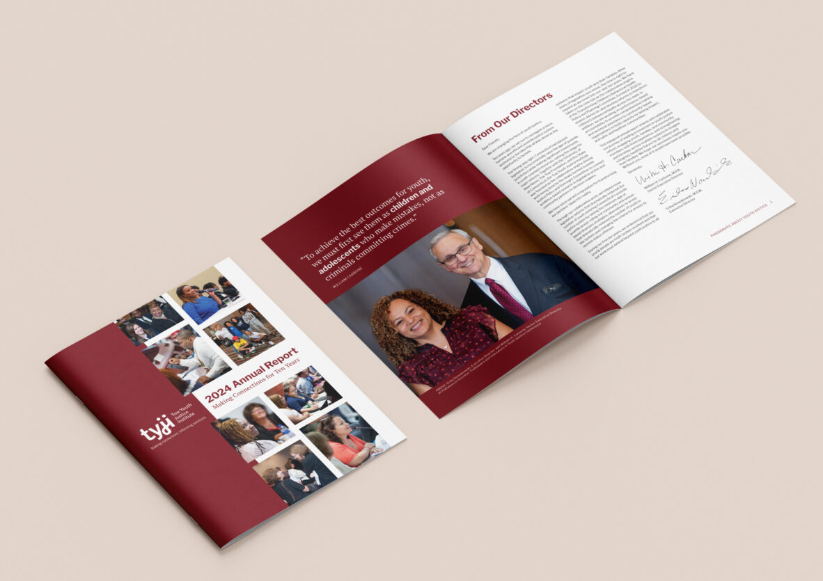
- Design TYJI’s tenth anniversary annual report
SERVICES
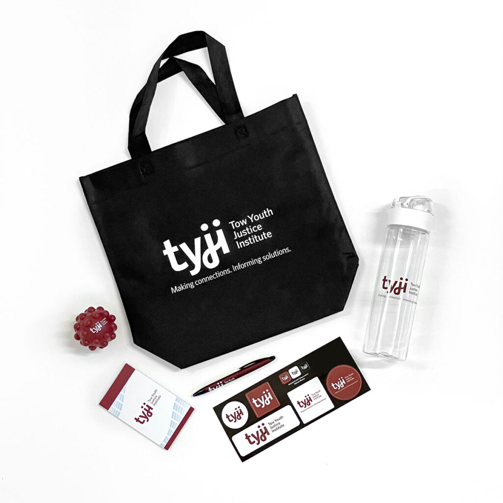
- Brand identity system and guidelines
- Branded templates
- Inaugural annual report
Visit website
towyouth.newhaven.eduSERVICES
- Brand identity system and guidelines
- Branded templates
- Inaugural annual report
Distill a complicated organization to its essence
We reviewed TYJI’s existing brand materials compared to the competitive landscape to identify opportunities for improvement and differentiation. We then led TYJI staff through a questionnaire and discussion to understand their work and to identify key brand attributes and values.
We identified the need to set the right tone of voice to convey more expansive ideas of justice. We were also challenged to make the story of what TYJI does feel less hard to grasp, since it involves many kinds of stakeholders and different types of work — from the legislation, to University of New Haven, to youth and their families.
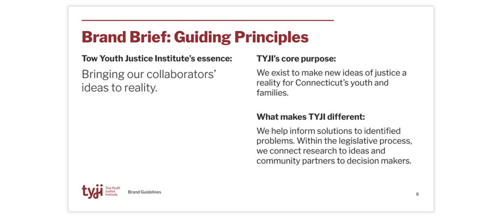
Through this discussion, we arrived at a series of attributes that define TYJI and strike a balance between professionalism and compassion. And as we developed a brand brief that outlined their attributes, purpose, and audiences, we arrived at the essence of the organization: “Bringing our collaborators’ ideas to reality.” That essence also inspired their tagline: “Making connections. Informing solutions.”
Develop a brand with professionalism and warmth
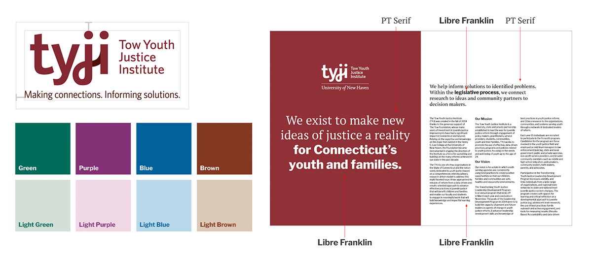
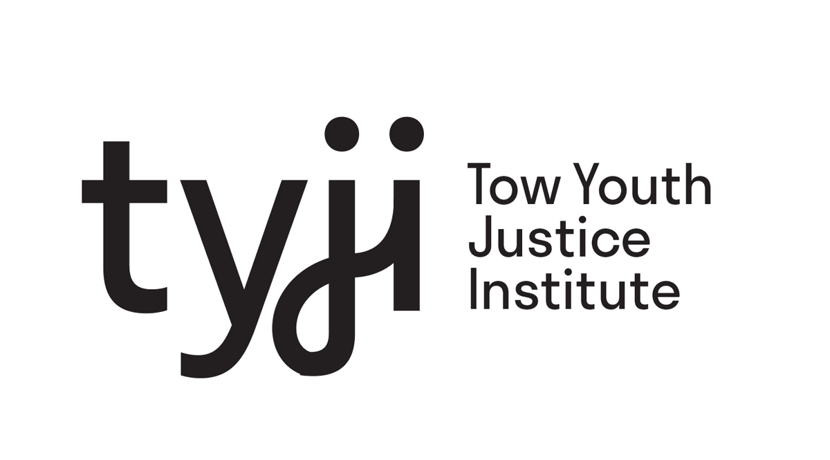
We explored several logo ideas and selected an option that called back to a key idea from our discussion: the human connection and impact that is the motivation for TYJI’s work. The j and the i in the mark subtly represent two individuals connected by the tail of the j.
We refined this mark and explored several color options that felt compatible with the justice competitive landscape while conveying professionalism and warmth. After selecting burgundy as the primary brand color, we developed a full color palette with accents that TYJI could use to visually indicate the different branches of their work.
In the brand guidelines, we provided written guidance on the proper use of the organization’s name and acronym.
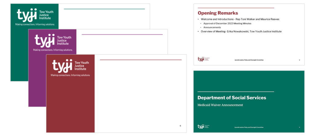
We defined a typographic system that balances professionalism and warmth, and ensured the typefaces selected would be accessible to all members of the TYJI team as they collaborated on shared documents.
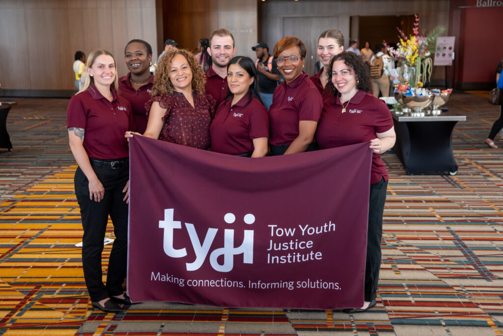
We applied all these elements of the new brand to PowerPoint and email newsletter templates that the TYJI team could use when they launched the brand at their 2024 Pathways to Success conference.
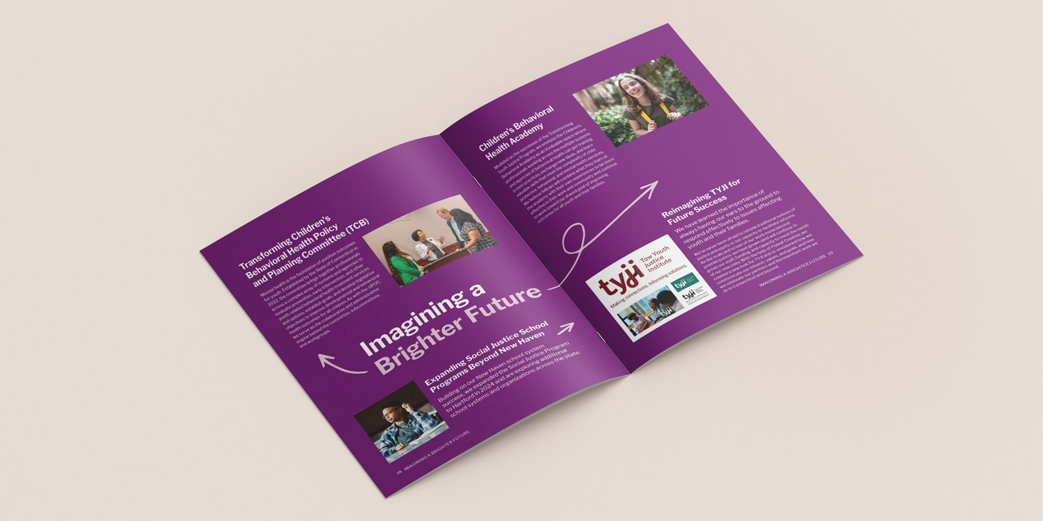
Design a first annual report to accessibly communicate their history and impact in the field
We began with moodboarding to help the client determine a visual tone for the report, after fully understanding the goals and audiences for their first report.
Flyleaf brought in a copywriter to help TYJI articulate their history and tell their story in the most accessible means possible.
We took an “outsider’s POV” on all of the content provided to make sure it could be understood by all potential readers, and requested contextualization and editing where we felt it helped better tell the story.
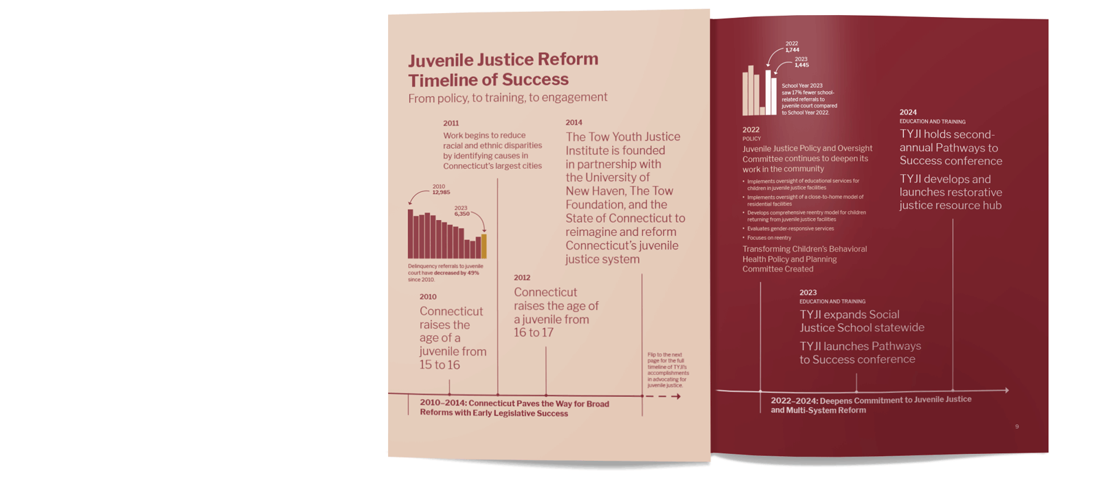
An important key to their story was to understand the timeline of events that led to TYJI’s founding and policy that has directly impacted or has been shaped by their work. Our timeline layout employed a fold-out page which encourages further engagement from the reader and allows the full breadth of TYJI’s history to stand out.
For our design, we selected photos that represent TYJI’s work as well as ones that depict the very groups involved in or impacted by TYJI’s work.
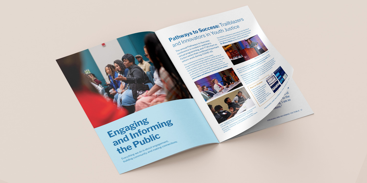
Our layout also utilized infographics, icons, and visual embellishments that help draw the eye, connect ideas, and set an appropriately playful but still professional tone throughout.