Lincoln Center Theater Review
The LCT Review is a literary magazine published up to three times a year by NYC arts institution and Tony Award-winning nonprofit, Lincoln Center Theater. Each issue of the magazine is centered around a different LCT production, offering content tailored to themes and the history of a show on their stage.Visit website
LCT.ORGWith new leadership at the helm of Lincoln Center Theater, and following the 40th anniversary of the organization, it was time to take their editorial magazine in a new direction.
The magazine and its brand are extensions of the work on stage which contribute to a comprehensive experience for LCT’s audiences, bringing them into the conversations around programming decisions, themes of the on-stage work, and how classic works are relevant today.
We were excited to design a branding system flexible enough to accompany any show’s theme, starting with their first Broadway show of the 2025–26 season, their acclaimed revival of the musical Ragtime.
The main components of our work were to:
- Signal to readers that this is a new era for the magazine with a redesigned identity
- Design an issue whose content was themed to LCT’s new production of the musical Ragtime
- Create a sustainable, collaborative process for working with the LCT team throughout the design process
SERVICES
- Visual Identity
- Publication Design Services
Visit website
LCT.ORGSERVICES
- Visual Identity
- Publication Design Services
Signal to readers that this is a new era for the magazine with a redesigned identity
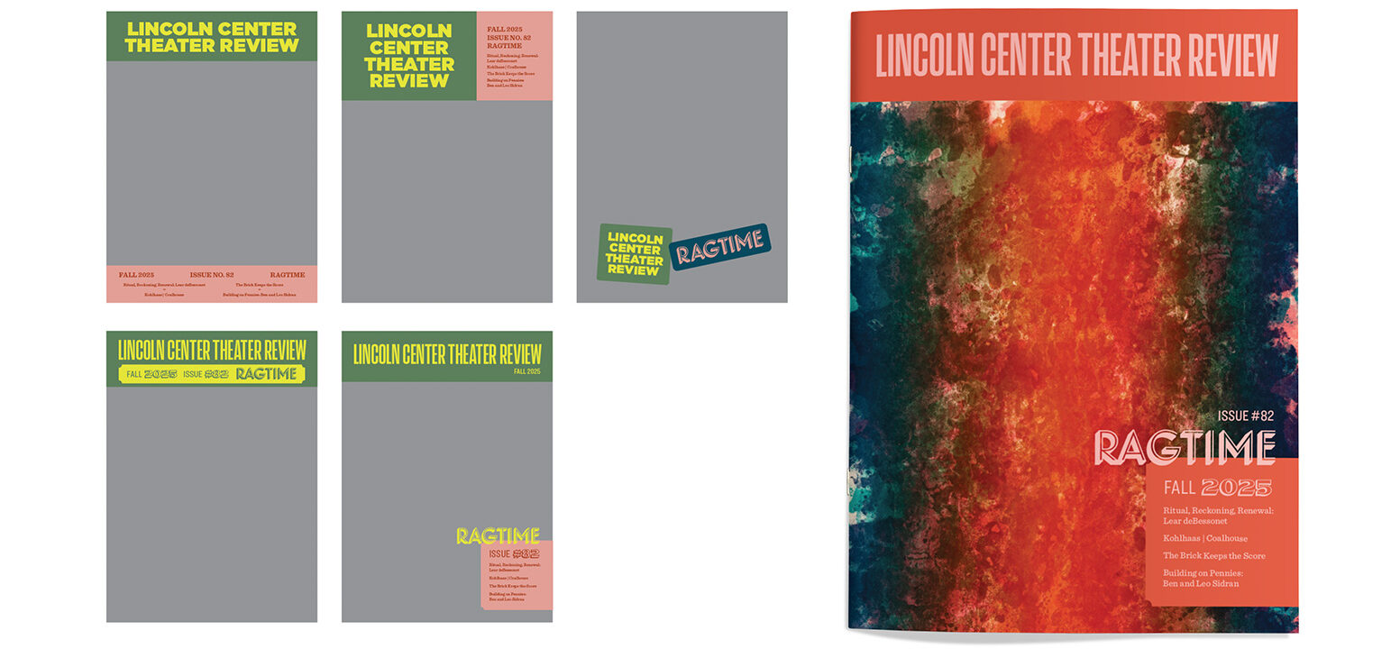
- We researched the landscape of literary, arts, culture, and theater magazines. Based on our findings, we proposed several approaches to a flexible and contemporary cover masthead that would position LCTR among like publications.
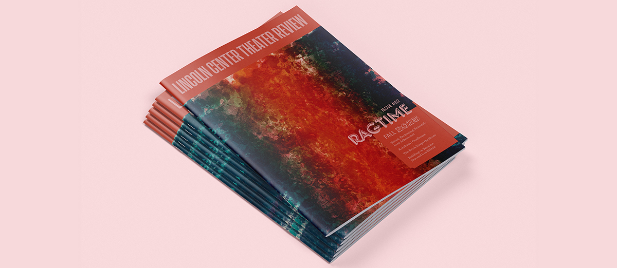
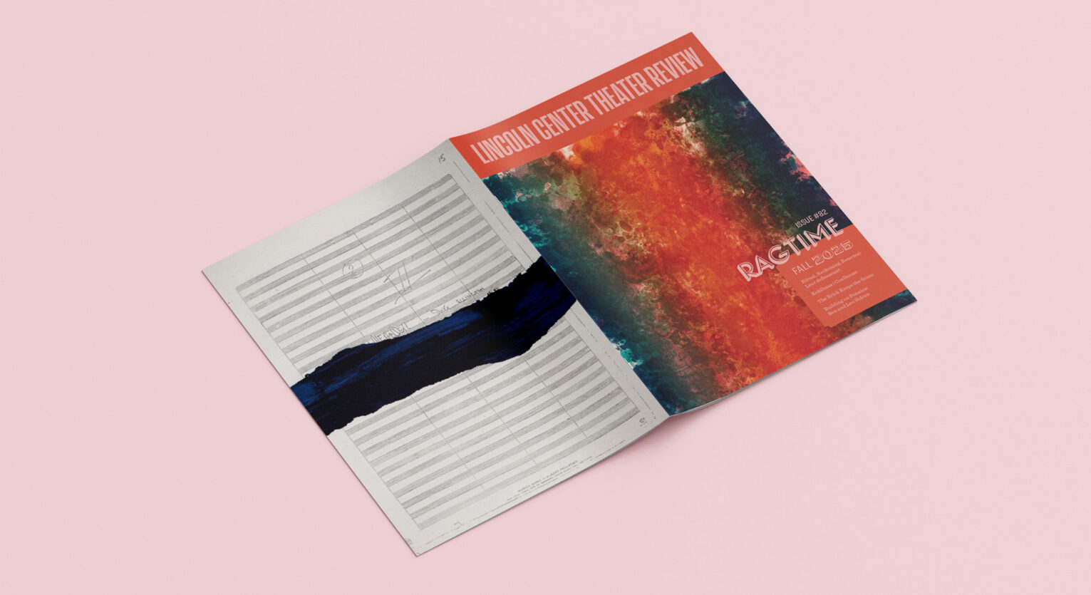
- The chosen cover masthead design gives new prominence to the magazine name in the dramatic condensed font Action Condensed. The show title now functions as a subtitle. The bold mark allows the magazine’s brand to shine as the surrounding artwork and color palette change from issue to issue.
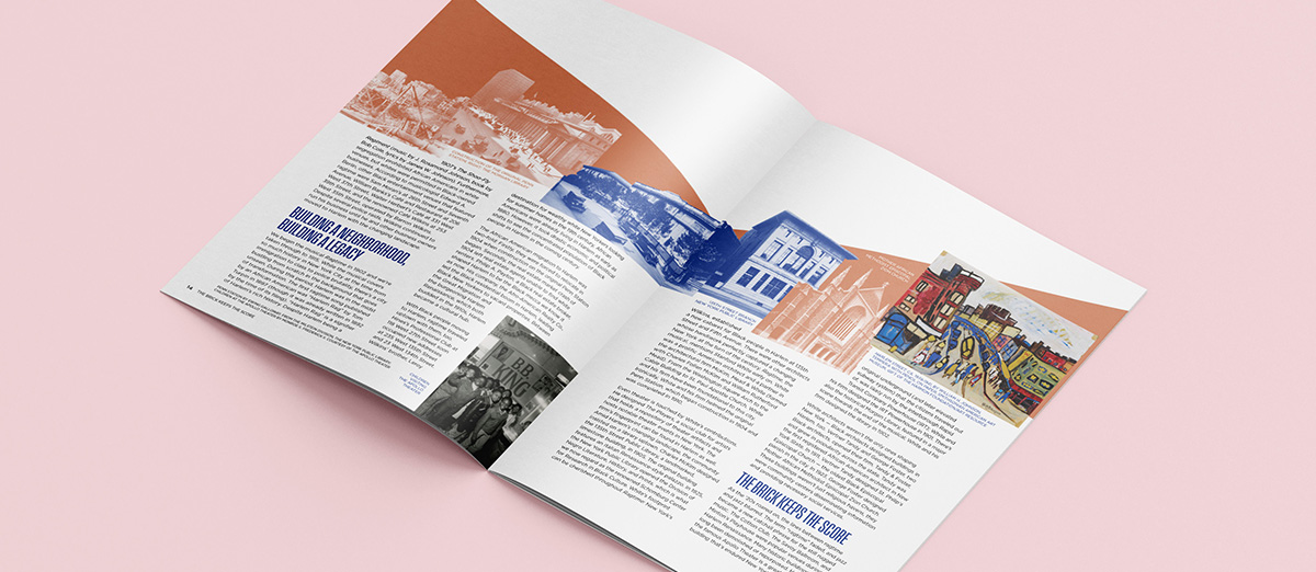
- We expanded our interior spread designs to utilize a 4-color palette, a visual change from the limited palettes of previous issues.
- Our team — which includes arts enthusiasts with a long history of attending LCT shows — provided a fresh pair of eyes and thought partnership for the brand. We reviewed past issues and led insightful conversations with the LCTR editor to determine a new approach that would introduce variety and drive interest over time while retaining the essence of Lincoln Center Theater.
Design an issue whose content was themed to LCT’s new production of the musical Ragtime
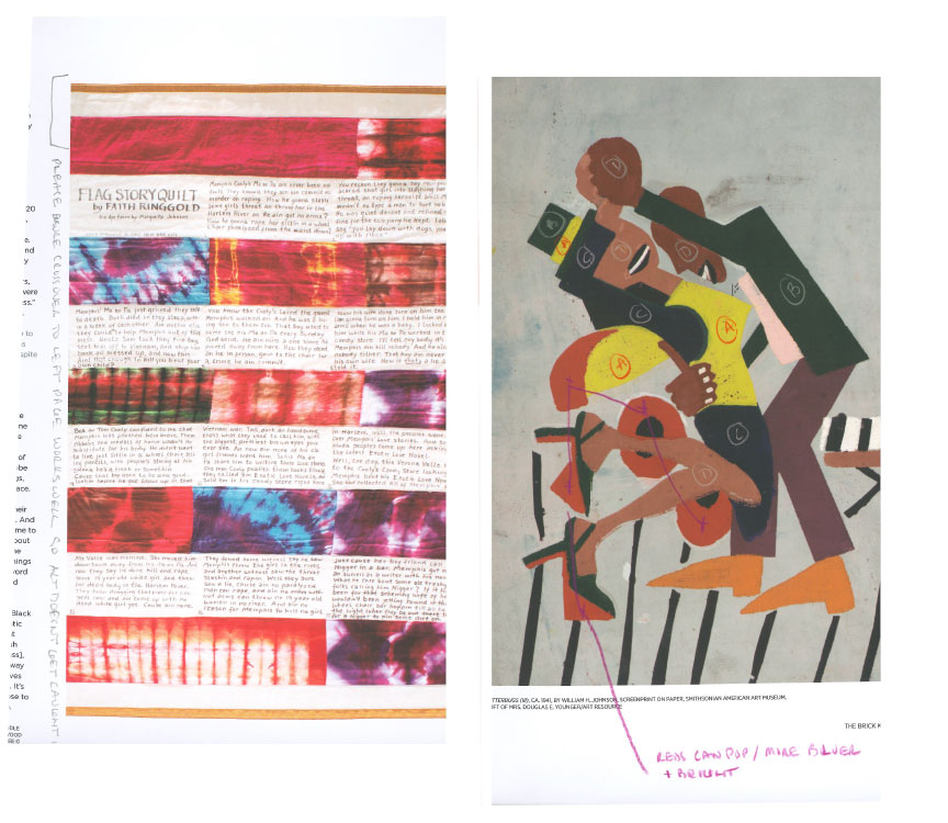
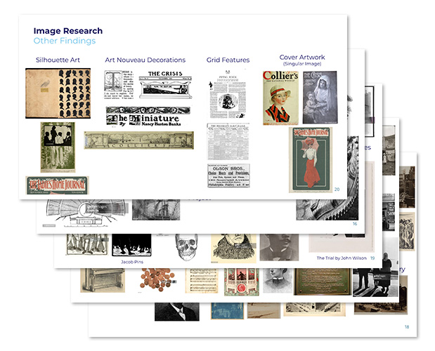
- Our team researched the show’s history and read the show’s libretto for a deep understanding of the musical, its setting, visual motifs, and metaphors.
- We developed several thematic moodboards to guide our visual approach to storytelling and image-making. We arrived at the concept of an “entangled multitude” which expresses the interwoven lives in Ragtime and a sense of musicality through overlapping elements, lively use of color, and a “syncopated” grid.
- We engaged in conversations with the magazine’s editor to understand the content being written for the magazine. We gathered historical imagery and artworks representative of the issue’s topics and themes, suitable for use on the cover or in interior spots. Our team turned to historical archives, online databases, and books to uncover a plethora of era-appropriate imagery.
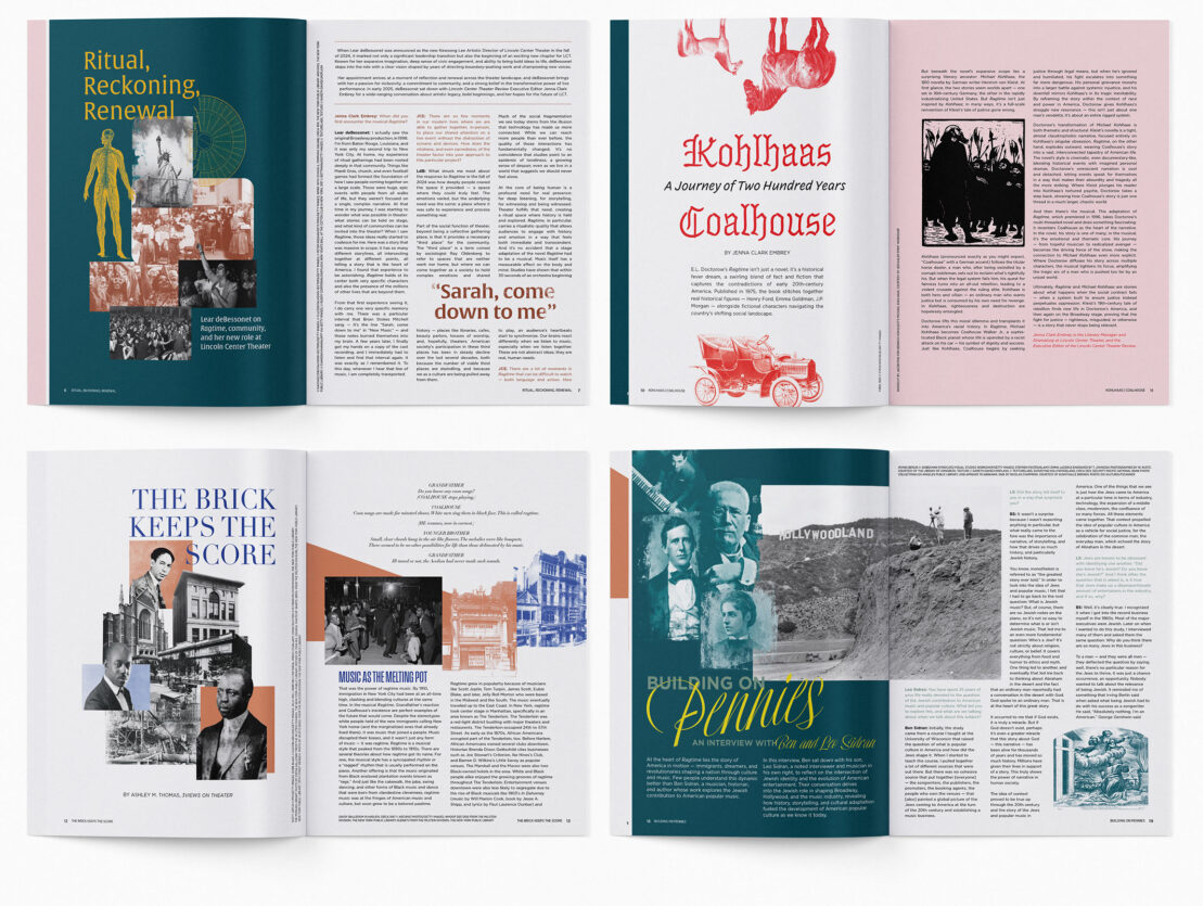
- We created layouts that were visually captivating, relying on layers of color and collage to help visually capture each nuanced story.
- While the article illustrations tie closely to the topics discussed, we chose abstract, expressive images for the covers. The front cover artwork, Fire by Sam Gilliam, evokes the intense culmination of the show.
- As editorial content was provided, we designed each story with typography, color palette, and image treatments appropriate for its themes, creating a system of styles with sufficient variety to help readers intuitively navigate the content and compel them to delve deeper into the content page after page.
Create a sustainable, collaborative process for working with the LCT team throughout the design process
- It was important for LCT Review to continue as a well-oiled machine, with tight deadlines tied to production timelines, and approvals tied to creative team availability; our team aimed to make the process of switching to a new design team seamless by providing schedules and talking through all expectations upfront.
- As we do with many projects, we employed a process that allows us to design based on initial copy drafts, giving content writers time to develop final copy without impeding on design work.
- Our designers worked closely with the magazine’s editor and photo editor to navigate approvals, offer proofreading suggestions, and most importantly, identify imagery whose rights needed to be secured in time for publication.
- As part of the printing process, we reviewed and corrected multiple sets of color proofs to ensure the artwork reproduced well on paper.