St. Ann’s Warehouse: 40th Anniversary Season Brochure
Creative partners for 25 years, we have developed a brand that’s all about the layering of texture and color. Working closely to get a deep understanding of the organization’s needs each year and the decision-making behind their programming, in 2019, we sought to create something special for St. Ann’s Warehouse’s 40th anniversary.
That year, we rethought how to best honor their 40 years and unveil an exciting avant-garde international program while giving brochure readers a whole new way to experience St. Ann’s.
Our designs considered:
- How a reader might interact with a piece they get in the mail — what will make them open it, read through, and engage with the content?
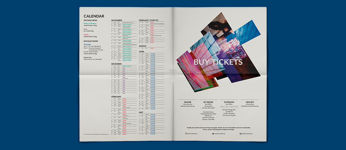
- How to use a very tactile format with unexpected layouts, tone, visual language, and pacing to bring to life each unique show while coming together to create a wholly impressive season package.
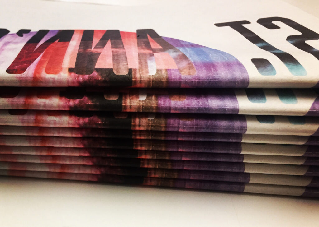
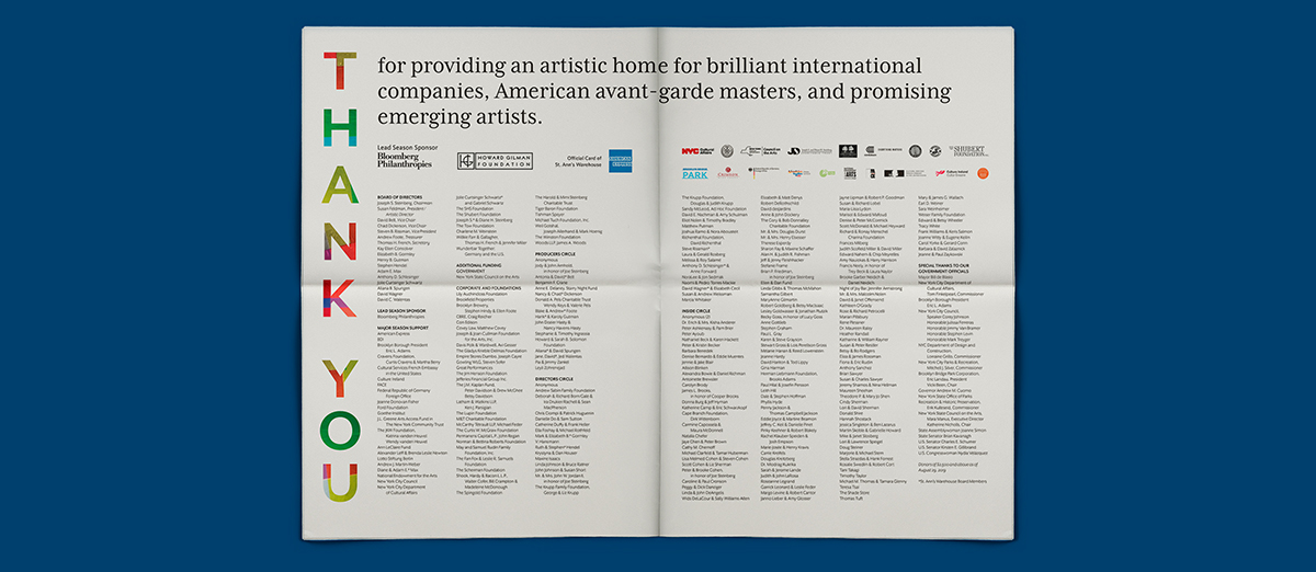
Printing on newsprint for all its beautiful grittiness, we created a series of non-formulaic spreads that highlight the best features of each show, and produced a piece that readers and other arts organizations talked about all season.
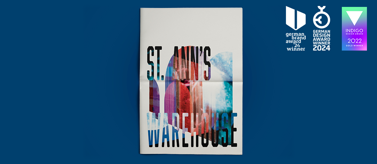
AWARDS:
German Brand Awards:
German Design Awards:
Indigo Awards:
AWARDS:
German Brand Awards:
German Design Awards:
Indigo Awards:
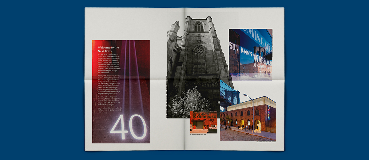
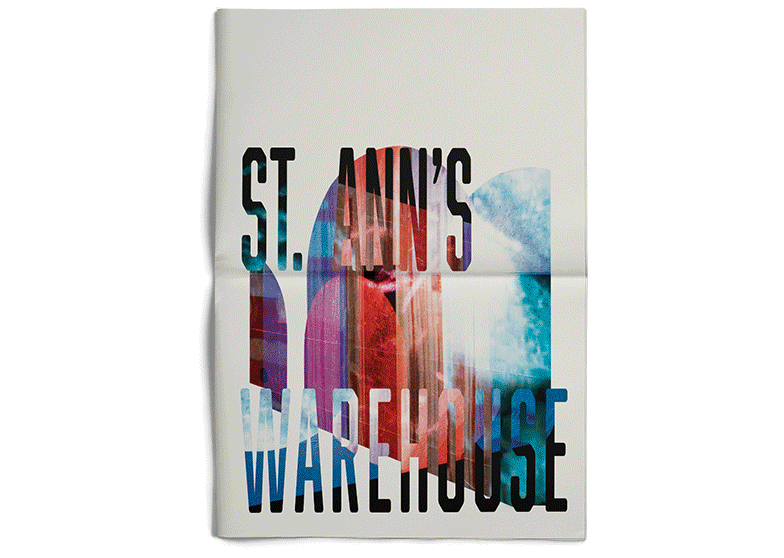
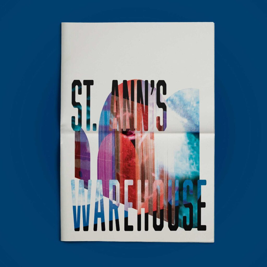
The Cover
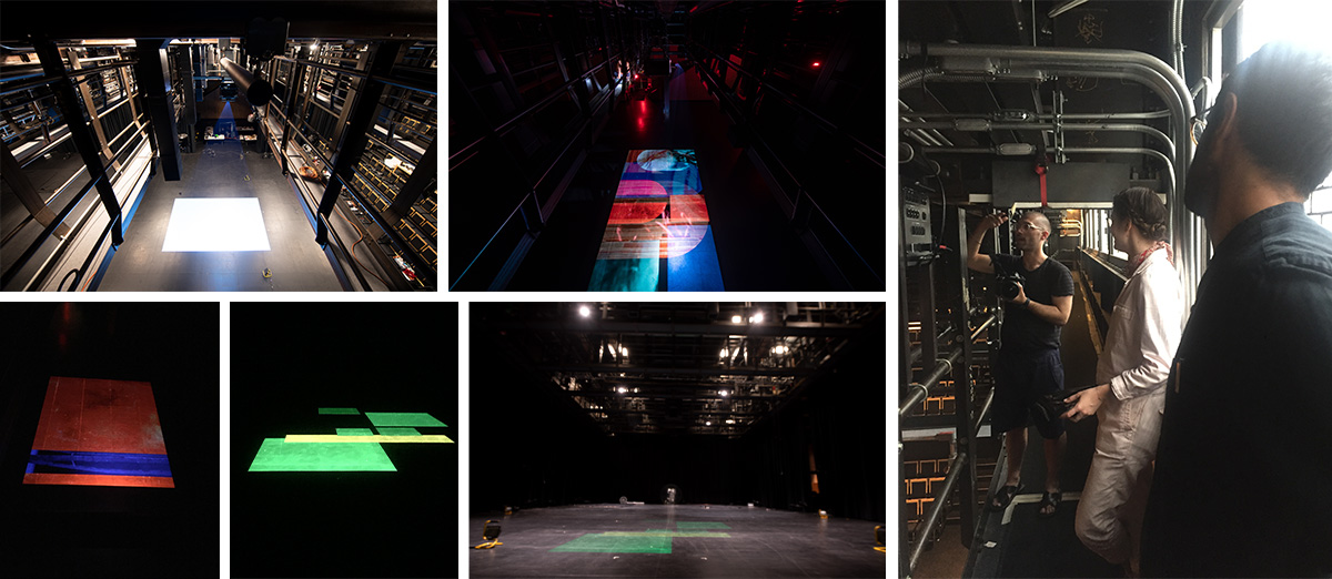
In approaching new assets that tied the brochure together and created an exciting cover image, we conceived slides of abstract imagery built from textures using photos — either of St. Ann’s previous homes or of productions from their long history of hits.
Those textural images were then projected onto the floor in the theater and captured with a long-exposure lens by photographer Teddy Wolff to create stunning layered photography we could utilize for color and texture on the cover and throughout the brochure.
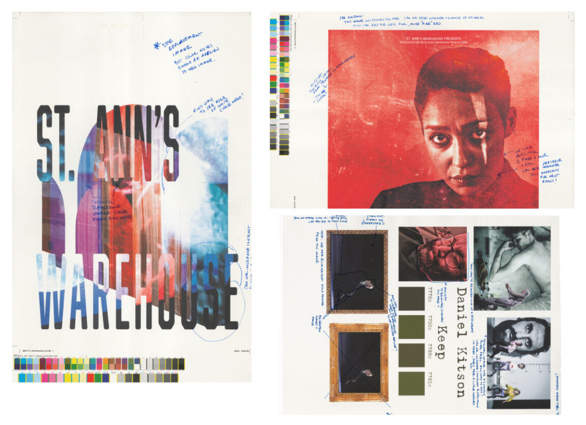
The Show Spreads
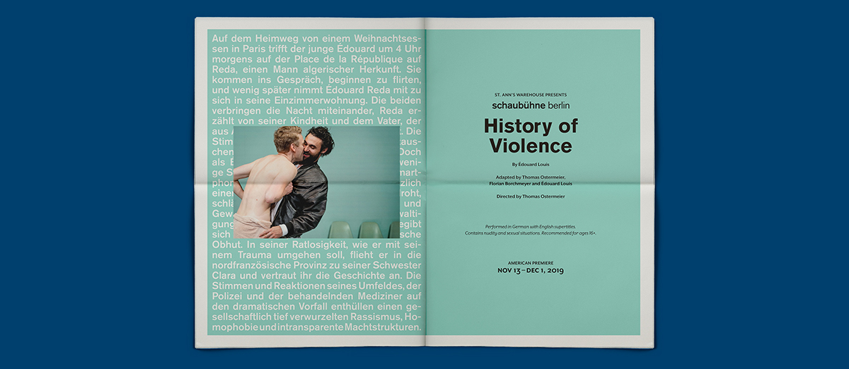
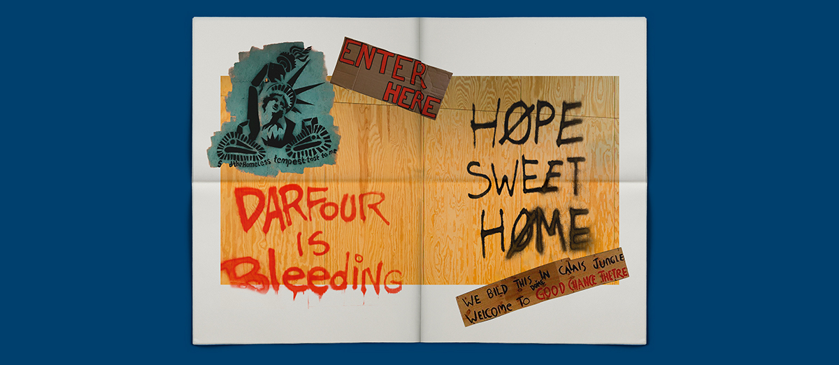
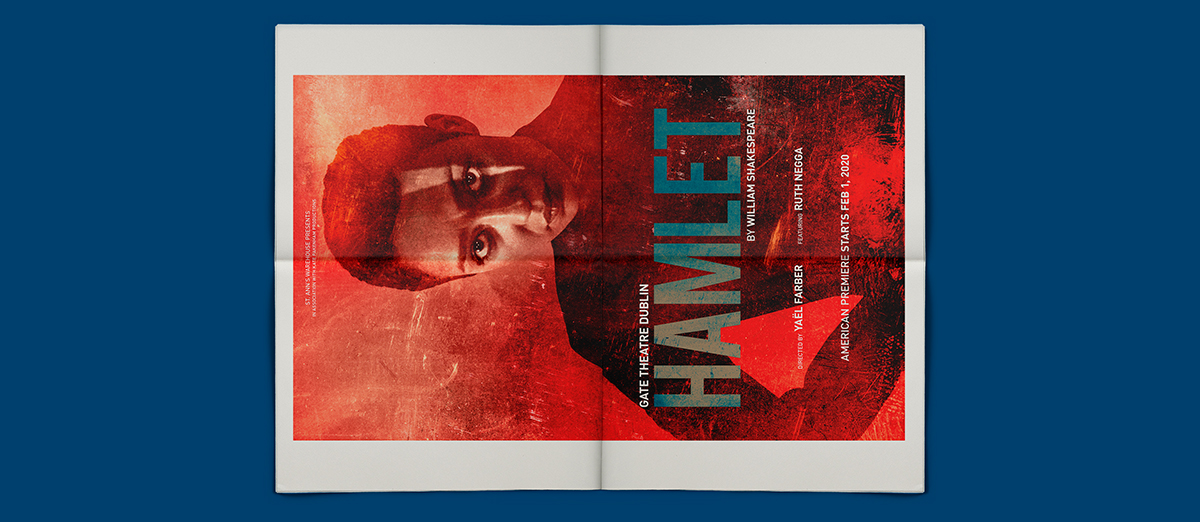
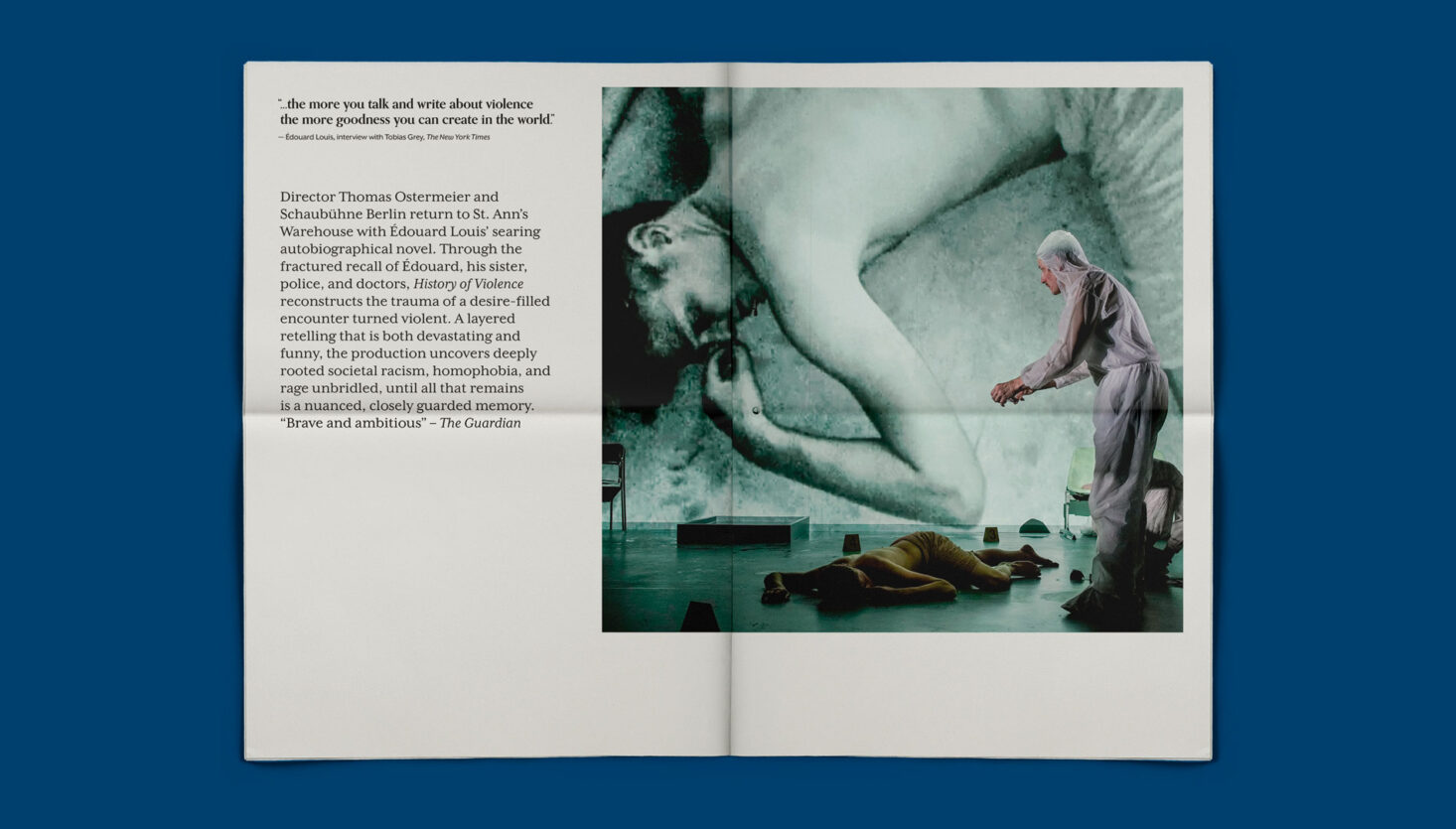
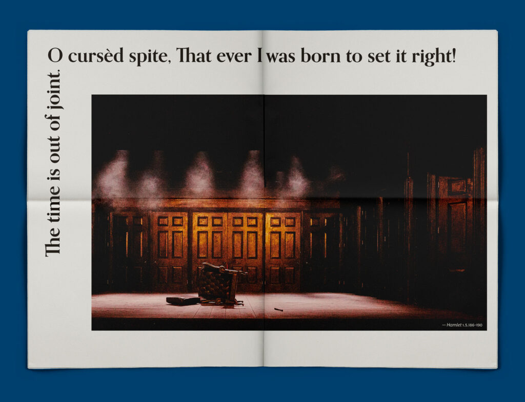
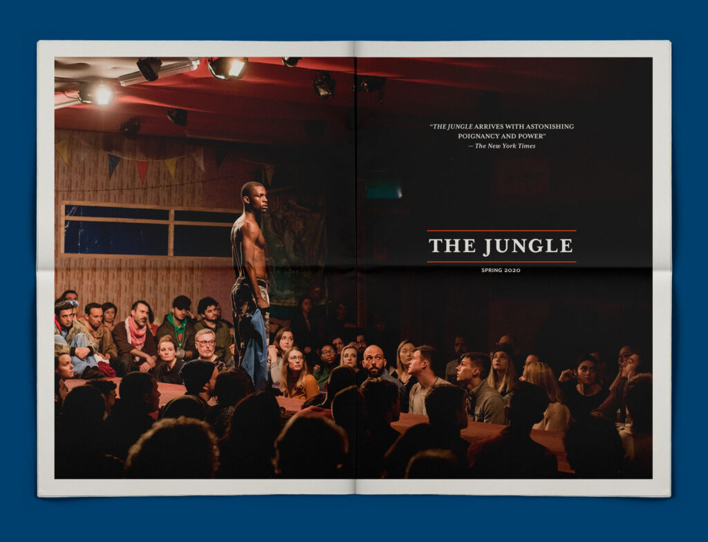
With a typically varied season, including productions from Germany, Ireland, and the UK, we wanted to create spreads that gave audiences not just information on each show, but brought them into the world of each in tone and emotion. That included creating spreads that were stark and hypnotizing for History of Violence, stylishly moody for Hamlet, direct and witty for Daniel Kitson’s Keep, and soulful for The Jungle.
The Process
Developing a season brochure is always an intricate process that involves finding the right balance of photography, existing key art, typography, language, and mood & tone for each show determined in close collaboration with the artistic team.